Din Vinhandel is a new webshop that isn’t here to compete with your local wine shop — in fact, it’s more like their new best friend.
With dedication, high quality, and outstanding customer service, Din Vinhandel enters the wine market with a fresh approach that sets them apart.
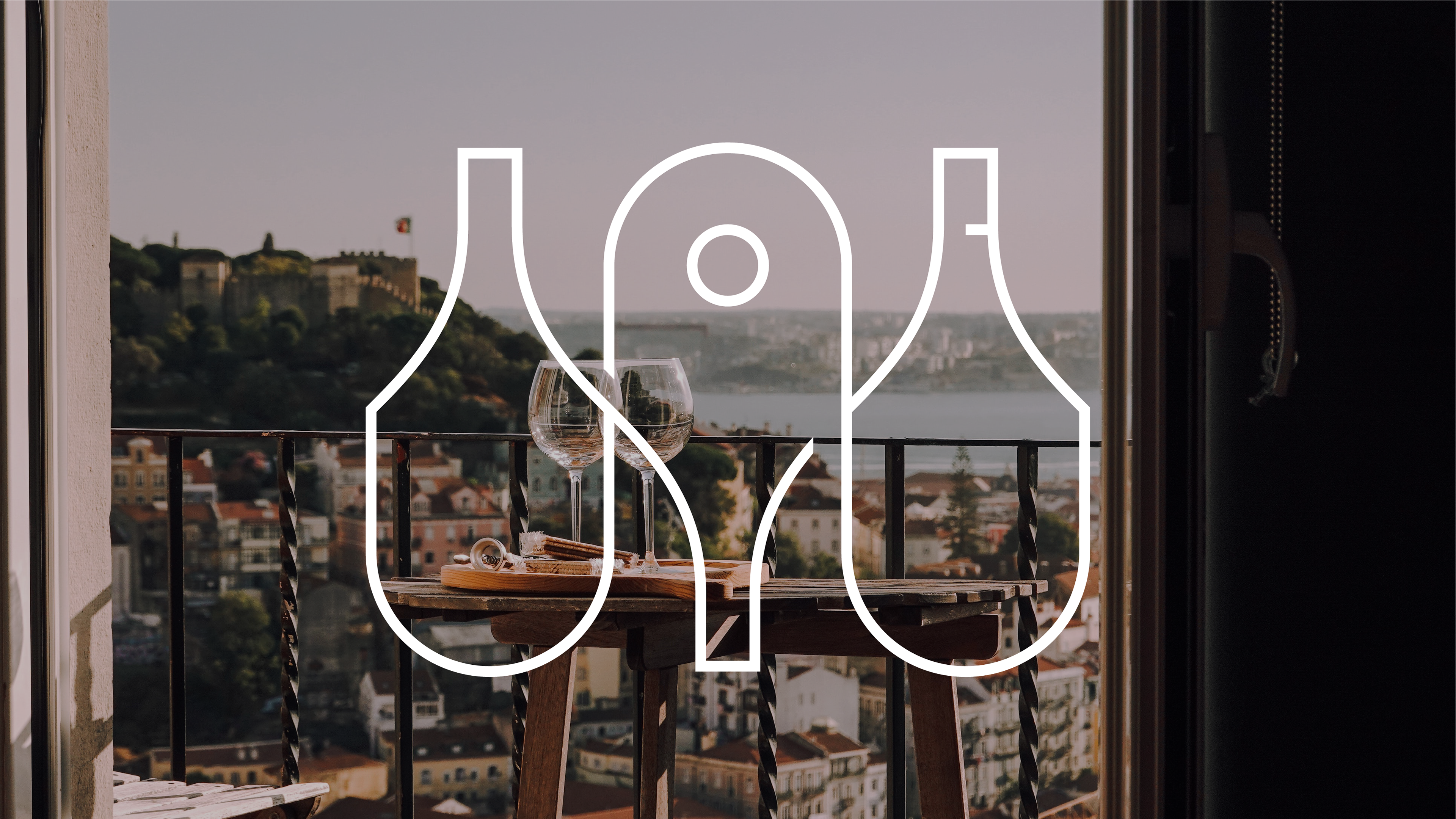
Of course, that needed to be supported by a strong visual identity. One that didn’t just default to the classic Bordeaux red used by 95% of wine retailers.


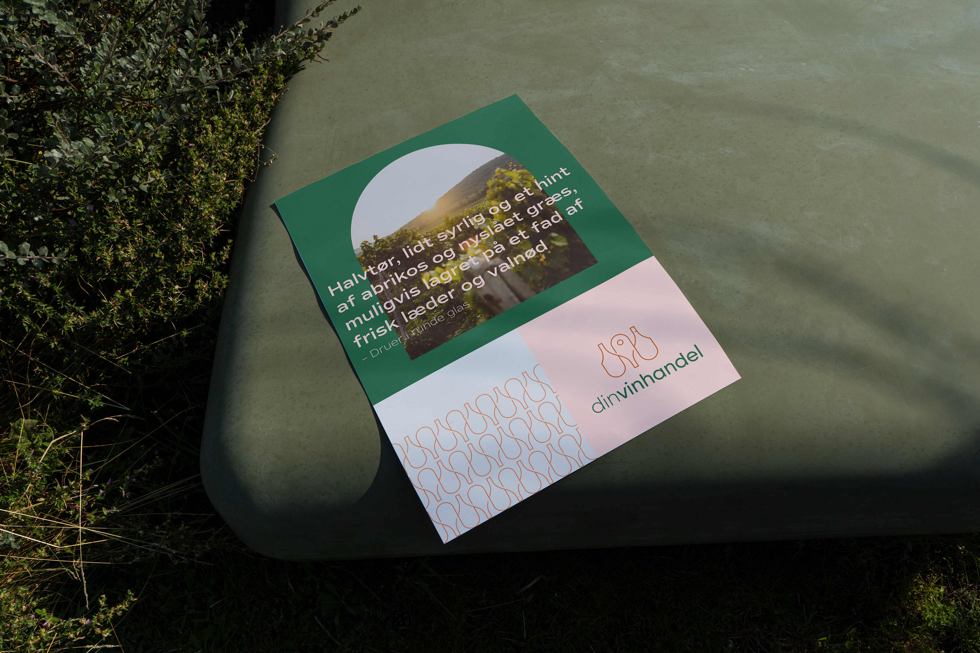
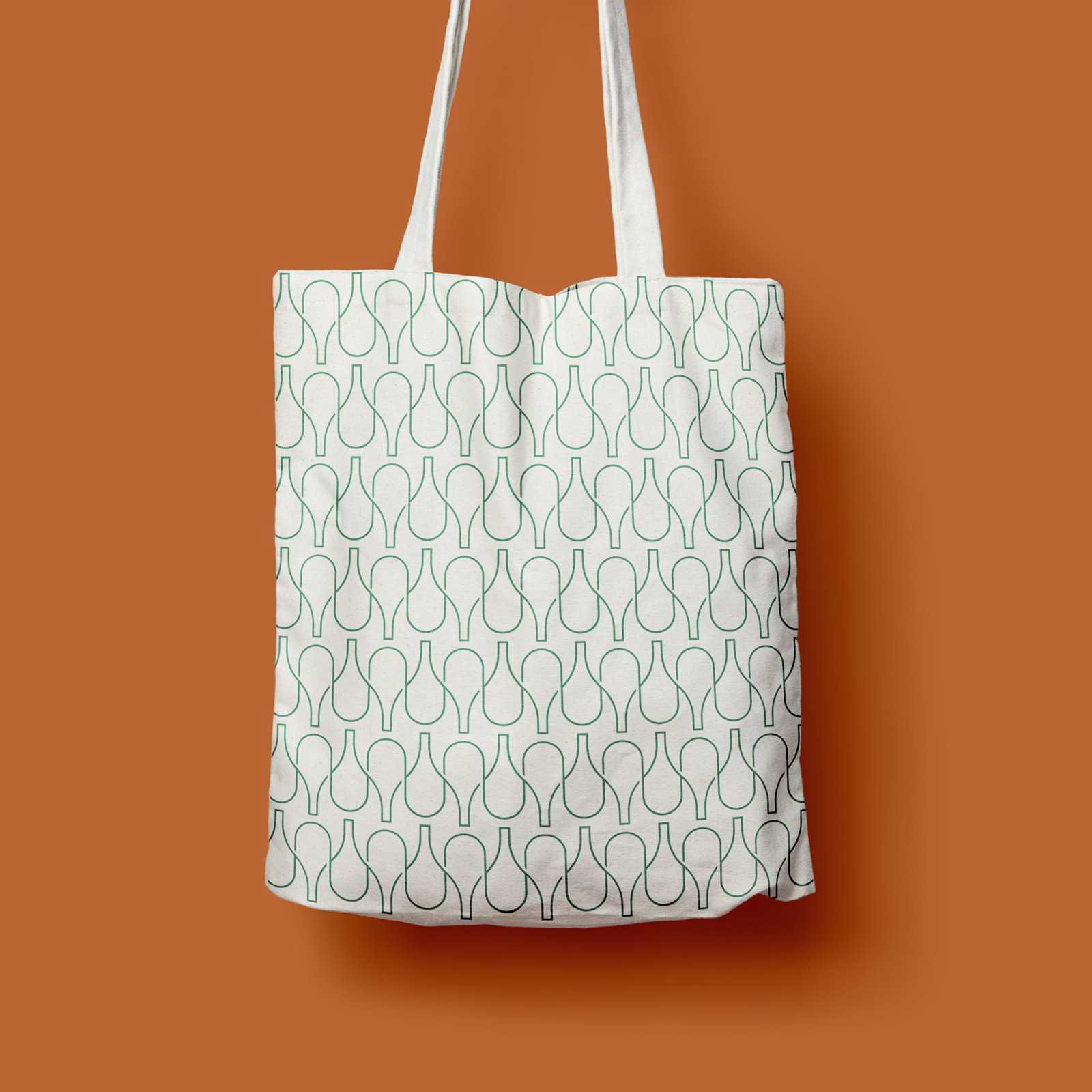
We used a series of design cues that naturally reference wine and create strong recognition.
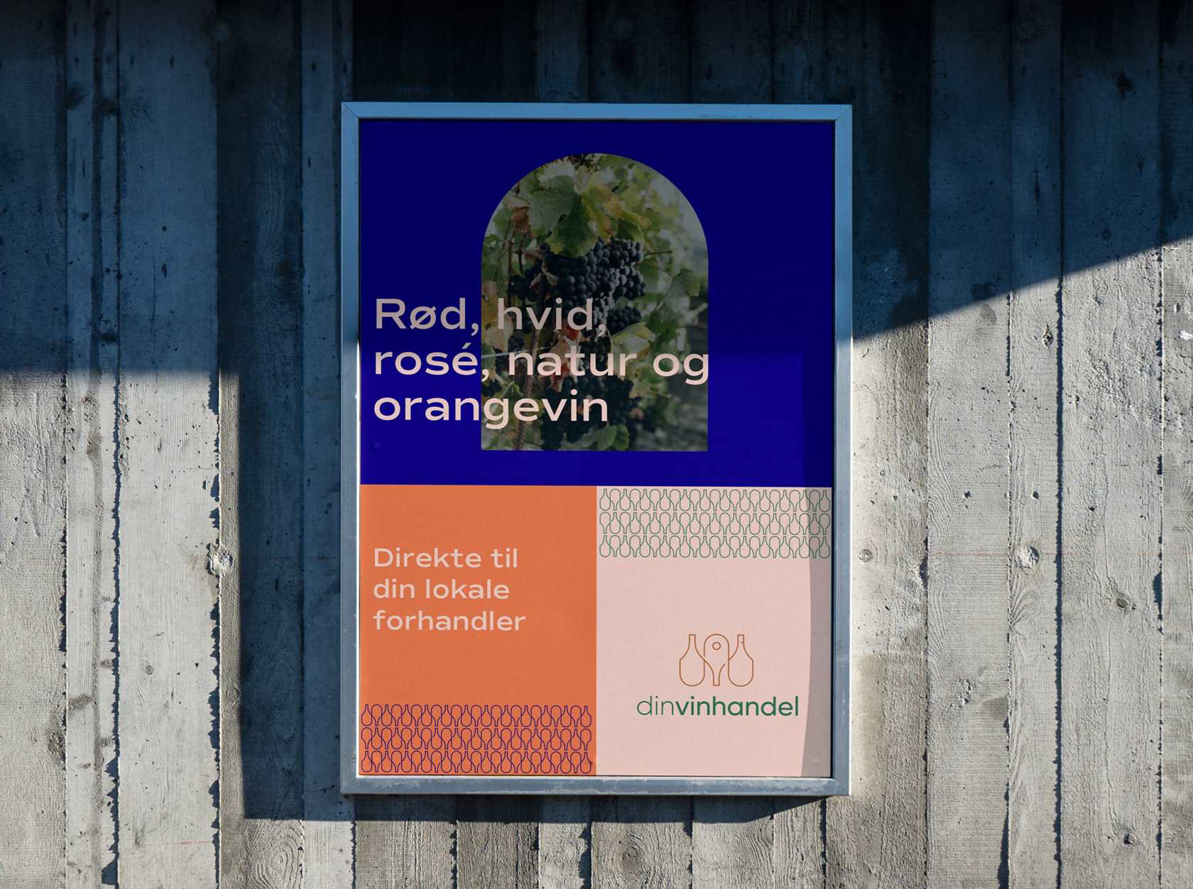
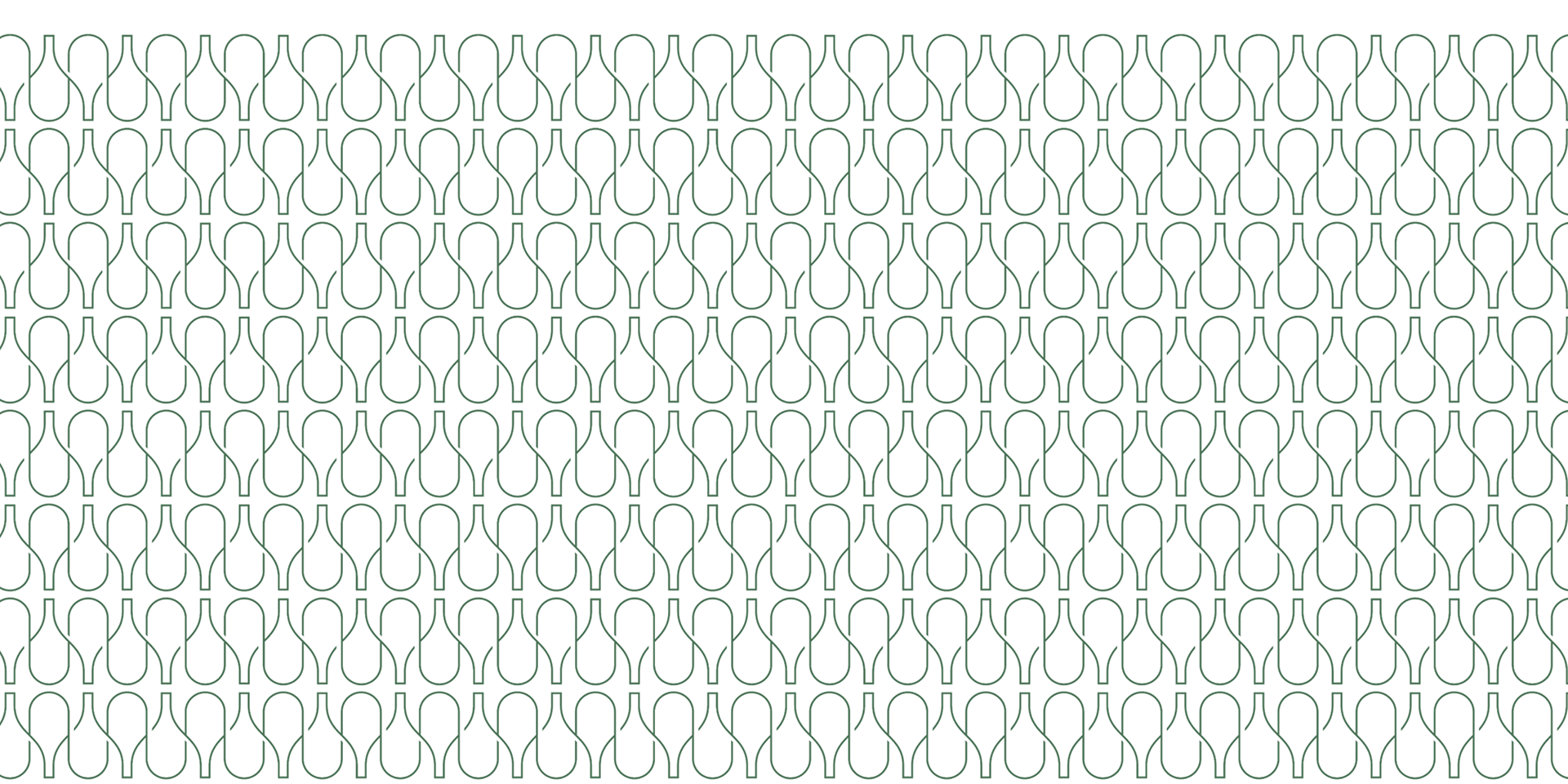
Take the wine label, for example. As one of the first things you look at when choosing a bottle, its shape became a core design element — used across visuals, graphics, and frames in different brand colors. A simple motif, but one that ties the identity together.
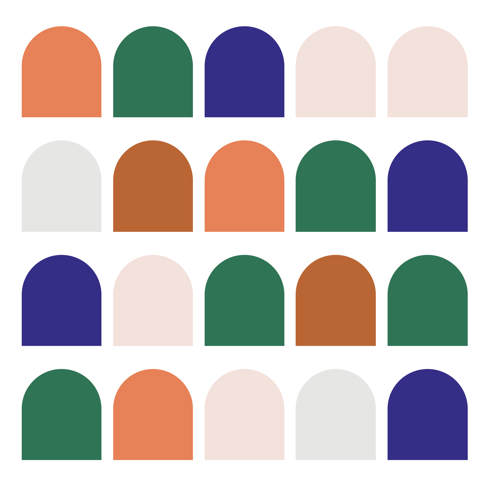
The color palette wasn’t chosen at random either. Each tone draws inspiration from grapes, vineyards, and wine varieties, resulting in a vibrant yet professional identity. Not classic Bordeaux red, but something more modern, high-quality, and alive.
Combined with a clear core narrative, this visual identity gives Din Vinhandel a strong foundation — ensuring that what customers see, hear, and experience is fully aligned.


In collaboration with: Vokseværk Design Bureau
Client: Din Vinhandel